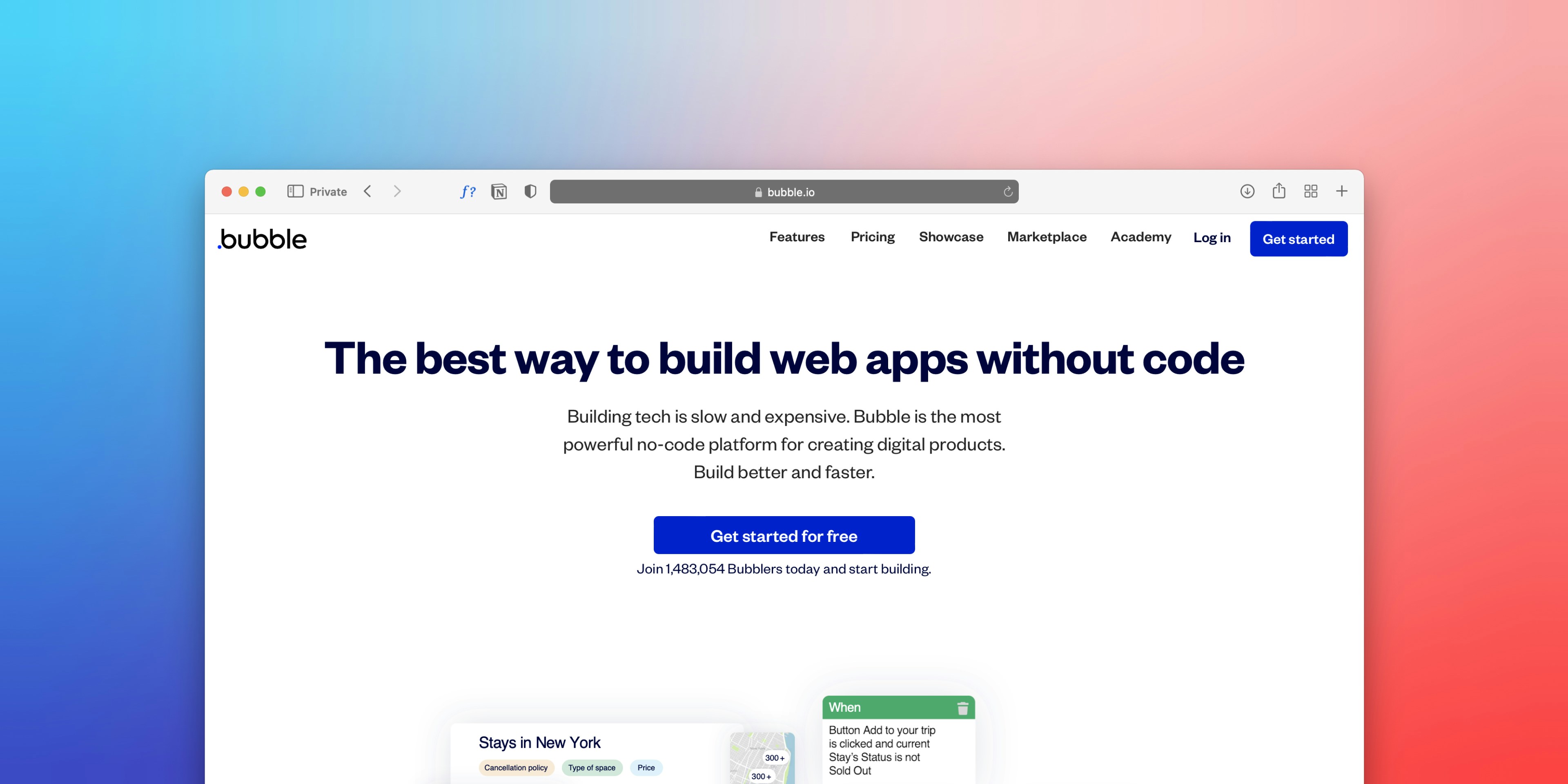
How to Create Clear Website Navigation
A great website starts with clarity. Visitors who land on your site want to find the right information quickly and without confusion. Clear and user-friendly navigation plays the leading role in this process. It’s not only important for user experience but also for search engine optimization (SEO). Google values websites that are logically structured and easy to crawl. That means a well-organized navigation doesn’t just help your visitors—it also boosts your online visibility.
Why Navigation Matters So Much
Navigation is more than just a menu bar with a few buttons. It’s the backbone of your website—the pathway that guides visitors from the homepage to the information they’re looking for. Whether someone wants to explore your services, learn more about your company, or get in touch with you, a clear structure ensures they won’t give up halfway. Without it, users often get frustrated and head straight to a competitor.
A strong navigation system also helps search engines understand how your website is structured. This makes it easier for Google and other search engines to index your pages, increasing your chances of ranking higher in search results. In other words, good navigation is a win-win: it benefits both your visitors and your SEO.
Keep It Simple and Intuitive
The golden rule of navigation is simplicity. Visitors should be able to find their way around without having to think twice. Use clear and familiar terms like Home, About Us, Services, and Contact. While creative labels like “Our World” or “What We Do” might sound appealing, they often confuse rather than help.
It’s equally important not to overload your menu. Too many options create clutter and decision fatigue. Instead, focus on the essentials and use subcategories where more depth is needed. This approach keeps things neat and accessible without leaving out valuable content.
Structure and Hierarchy Bring Balance
A strong navigation system has a clear hierarchy. This means separating main pages from subpages in a logical way. For example, your primary menu might include Services or Products, with dropdown menus offering more specific options. This keeps your navigation bar clean and tidy, while still giving users easy access to detailed information.
For content-heavy websites like blogs or online stores, structure becomes even more crucial. Categories, tags, and filters help visitors narrow down their search and prevent them from feeling lost in a maze of pages.
Always Accessible with a Sticky Menu
Modern websites often benefit from a sticky navigation bar. This type of menu stays visible at the top of the screen even when users scroll down. It’s a small detail, but one that greatly improves usability—especially on long pages. Visitors can quickly move to another section without having to scroll all the way back to the top.
Mobile-Friendly Navigation
With more and more people browsing on their smartphones, mobile-friendly navigation is no longer optional—it’s essential. The familiar “hamburger menu” (the three stacked lines) is often the best solution. Make sure it opens smoothly, is easy to use with a thumb, and remains clear and uncluttered. A poorly designed mobile menu is one of the fastest ways to lose potential customers.
Extra Functionality: Search
For larger websites, a search bar is an invaluable addition. It allows visitors to find specific information instantly without clicking through multiple pages. This saves time and demonstrates that you’re thinking about user convenience. It’s also useful for SEO: analyzing the keywords visitors type into your search bar can provide insights into what your audience is really looking for.
Conclusion: Navigation as the Foundation of Your Website
Clear website navigation isn’t a luxury—it’s the foundation of every successful site. It determines whether visitors can easily find what they need or leave in frustration. Keep your menu simple, logical, and intuitive. Create a clear structure, ensure a mobile-friendly design, and add a search function where it makes sense.
At Temblit, we believe a website only truly works when the user experience comes first. By designing smart navigation, you make your site not only more attractive and user-friendly but also more search-engine friendly. Take the time to build this foundation properly—it will reward you with satisfied visitors, better SEO rankings, and more conversions.