10 Unexpected Color Combinations That Work
Color combinations can be a powerful tool to evoke emotions, grab attention, and strengthen your brand identity. Some combinations may seem bold or unusual at first glance, but when applied correctly, they can work surprisingly well. Here are ten inspiring examples of unexpected color pairings and why they are effective.
1. Mustard Yellow and Lavender
This pairing creates a unique balance between warmth and softness. Mustard yellow conveys energy and confidence, while lavender has a calm and refined appeal. Together, they create a fresh and creative look that works perfectly for fashion or interior design brands.
2. Navy Blue and Salmon Pink
Navy blue is often associated with professionalism and trust, while salmon pink adds a playful and friendly touch. This contrast makes the combination ideal for business brands seeking a more approachable and human look.
3. Ochre Yellow and Gray-Green
Ochre yellow evokes feelings of nostalgia and warmth, while gray-green adds an earthy and serene atmosphere. This mix works well in branding for sustainable and eco-friendly companies.
4. Turquoise and Tomato Red
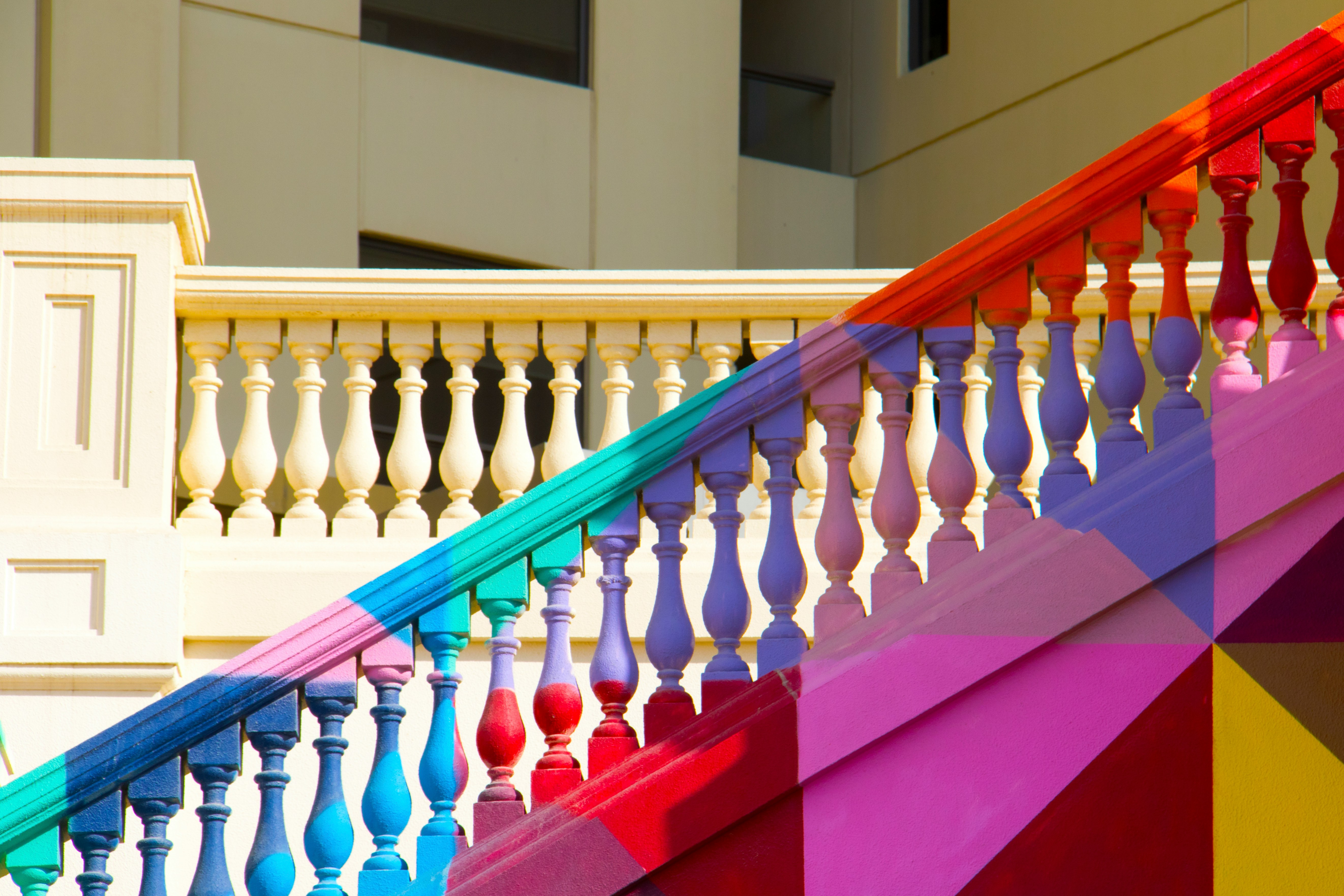
The coolness of turquoise creates a surprisingly vibrant contrast with the intensity of tomato red. This duo grabs attention and is well-suited for creative brands wanting to stand out.
5. Olive Green and Apricot
Olive green provides a calm, natural base, while apricot adds a soft yet lively accent. This palette is especially fitting for wellness and lifestyle brands aiming to communicate freshness and tranquility.
6. Cobalt Blue and Chartreuse
Cobalt blue is powerful and intense, while chartreuse (a yellow-green shade) offers an energetic and striking complement. Together, they form a dynamic combination perfect for tech or sports brands.
7. Violet and Mint Green
The depth of violet is beautifully balanced by the airy freshness of mint green. This pairing works well for brands in industries like beauty, where luxury meets accessibility.
8. Reddish Brown and Ice Blue
Reddish brown conveys warmth and stability, while ice blue adds a cool, refreshing element. This contrast creates a balanced and appealing effect, ideal for traditional or artisanal brands.
9. Peach and Emerald Green
Peach is soft and inviting, while emerald green radiates energy and luxury. This combination is effective for brands seeking an elegant yet approachable style.
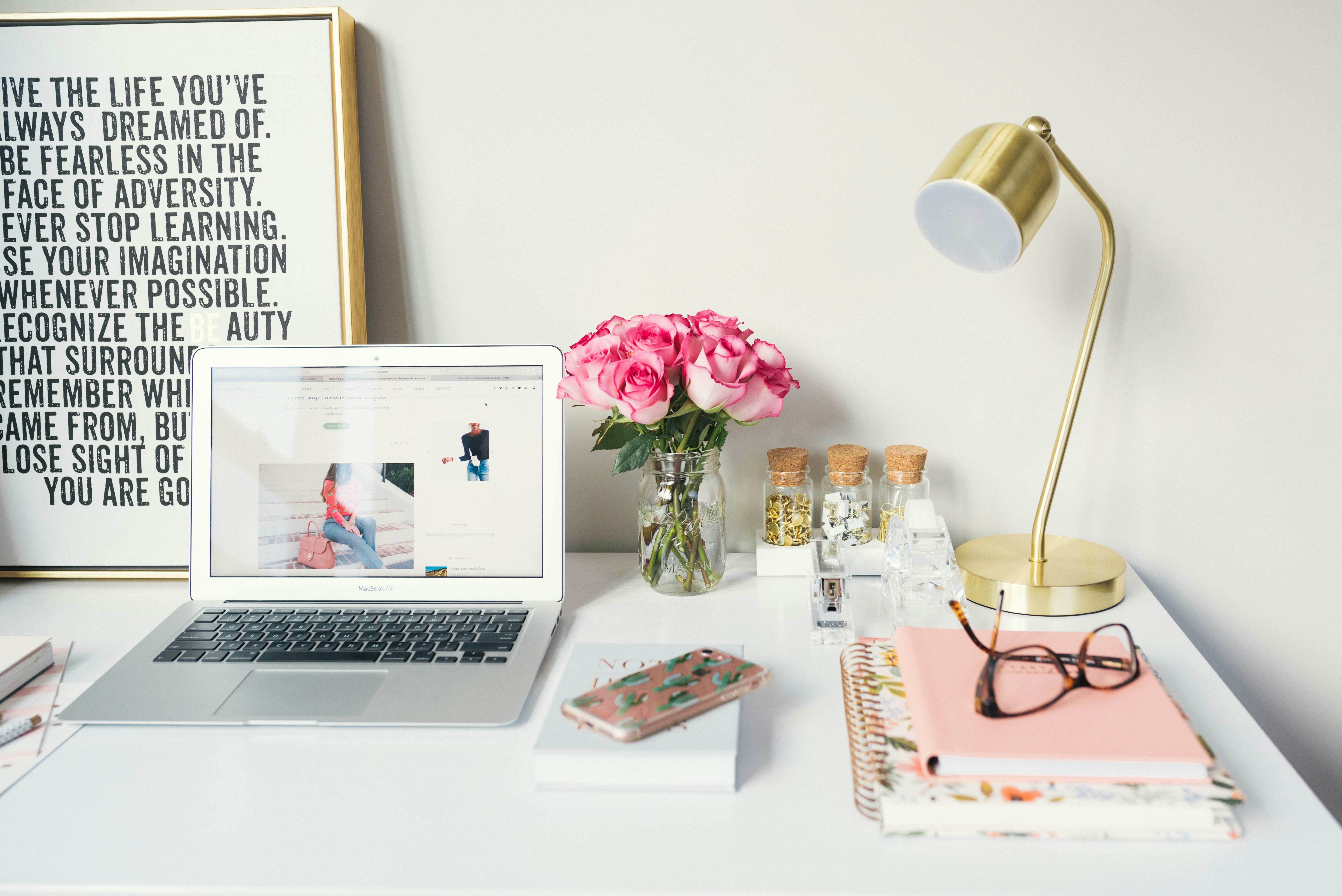
10. Fuchsia and Gold
Fuchsia is vibrant and energetic, while gold adds a sense of wealth and sophistication. Together, they create a bold, extravagant look suited for events or high-end brands.
Conclusion
Unexpected color combinations are an excellent way to make your brand stand out and leave a lasting impression. By experimenting with contrasting shades or subtle nuances, you can create unique designs that are both visually appealing and effective. Whether you’re working on a logo, website, or marketing campaign, these pairings are worth considering to take your project to the next level.

